Your website is the face of your business online. It’s often the first thing potential customers see, and it can make or break their decision to work with you. But how do you know when it’s time to give your website a fresh new look? As someone who’s helped countless businesses revamp their online presence, I’ve got the inside scoop on when it’s time to hit that redesign button.
If you’re a business owner wondering if your website is still up to snuff, this guide is for you.
Let’s dive into the five telltale signs that scream, “Hey, it’s time for a website makeover!”
1. Your Content Management System is a Pain in the Neck
Picture this: you’re trying to update your website’s content, but it feels like you’re wrestling an angry octopus. Sound familiar? If editing your website makes you want to pull your hair out, it’s a clear sign you need a change.
Here’s the deal: a good website should be as easy to update as posting on social media .If you’re spending hours just to change a few words or add a new product, you’re wasting precious time that could be spent growing your business.
Did you know that businesses that regularly update their content see 55% more website visitors? That’s right – fresh content is like a magnet for potential customers. But if your website is a nightmare to update, chances are you’re not doing it as often as you should.
The fix? Consider switching to a user-friendly content management system (CMS) like WordPress. It’s like upgrading from a rusty old bicycle to a sleek electric scooter – suddenly, updating your site becomes a breeze!
2. Your Website Looks Like It’s Stuck in a Time Warp
Let’s face it – first impressions matter. If your website looks like it’s from the era of dial-up internet, you’re in trouble. Studies show that 94% of first impressions are design-related. That means if your site looks outdated, potential customers might think your business is too.
I once worked with a client whose website looked straight out of 1999. They were losing customers left and right, even though their product was top-notch. After a redesign, their online sales shot up by 300% in just three months!
Here’s a quick test: pull up your website and a competitor’s side by side. Does yours look fresh and modern, or does it feel like comparing a flip phone to a smartphone? If it’s the latter, it’s time for an upgrade.
Remember, your website is like your digital storefront. You wouldn’t let your physical store look shabby, so why let your website fall behind?
3. Your Website Moves Slower Than a Snail in Molasses
In today’s fast-paced world, speed is everything. If your website takes forever to load, you’re losing customers faster than you can say “buffering.”
Did you know that 53% of mobile users will leave a site that takes longer than three seconds to load? That’s right – you’ve got just three seconds to make an impression. If your site is crawling along, it’s time for a turbo boost.
I once had a client whose website took a whopping 15 seconds to load. After we optimized it, their bounce rate dropped by 70%, and their conversions skyrocketed. It was like watching a tortoise transform into a cheetah!
Slow loading times aren’t just annoying – they’re costing you money. Google estimates that for every extra second a page takes to load, conversions can drop by 12%. Ouch! Test your website speed here for free: https://pagespeed.web.dev/
4. Your Website Security is Shakier Than a House of Cards
Here’s a scary stat for you: small businesses are the target of 43% of cyber attacks. If your website security is weaker than a wet paper bag, you’re basically rolling out the red carpet for hackers.
I’ve seen firsthand what a security breach can do to a business. One of my clients had their customer data stolen because their website security was outdated. It took months to rebuild trust with their customers, and their sales took a massive hit.
Think your business is too small to be a target? Think again. Hackers often go after smaller businesses because they know their security is usually weaker. It’s like a burglar choosing to rob a house with no alarm system – you’re an easy target.
Upgrading your website isn’t just about looks – it’s about building a digital fortress to protect your business and your customers.
5. Your Website is a Lead Generation Desert
At the end of the day, your website has one main job: to bring in business. If your site is about as effective at generating leads as a chocolate teapot, it’s time for a change.
Businesses with optimized websites generate 67% more leads than those without. That’s a lot of potential customers you could be missing out on!
I remember working with a local bakery whose website was basically just an online brochure. We redesigned it to include an online ordering system and a newsletter sign-up. Within a month, their online orders increased by 200%, and their email list grew from 50 to 500 subscribers.
Your website should be your hardest-working employee, bringing in leads 24/7. If it’s slacking on the job, it’s time to whip it into shape!
The Bottom Line: Don’t Let Your Website Hold You Back
Your website is more than just a digital business card – it’s a powerful tool that can make or break your business. If you’ve noticed any of these signs, it’s time to seriously consider a website makeover.
Remember, investing in your website is investing in your business’s future. A well-designed, user-friendly, and secure website can be the difference between struggling to get by and watching your business thrive.
So, take a good, hard look at your website. Is it helping your business grow, or is it holding you back? If it’s the latter, don’t wait – the sooner you upgrade, the sooner you’ll see results.
Trust me, I’ve seen countless businesses transform their online presence and watch their profits soar. Your website has the potential to be your most valuable asset – isn’t it time you gave it the attention it deserves?


 Outsourcing Pay per click Management is one of the most effective and easiest ways to advertise or market your business or your products. Pay per click marketing has a very easy process; what you have to do is to just make an advert and choose a keyword or a phrase that is related to your ad representing your business or your product. When people search online, and they type in a word or a phrase which matches your keyword, your ad will appear next to the search result. Now you are advertising you product or whatever it is that want to advertise. The people who are interested in your services will click on your ad and to be able to buy your product or to know more about your company. A
  When you use professional
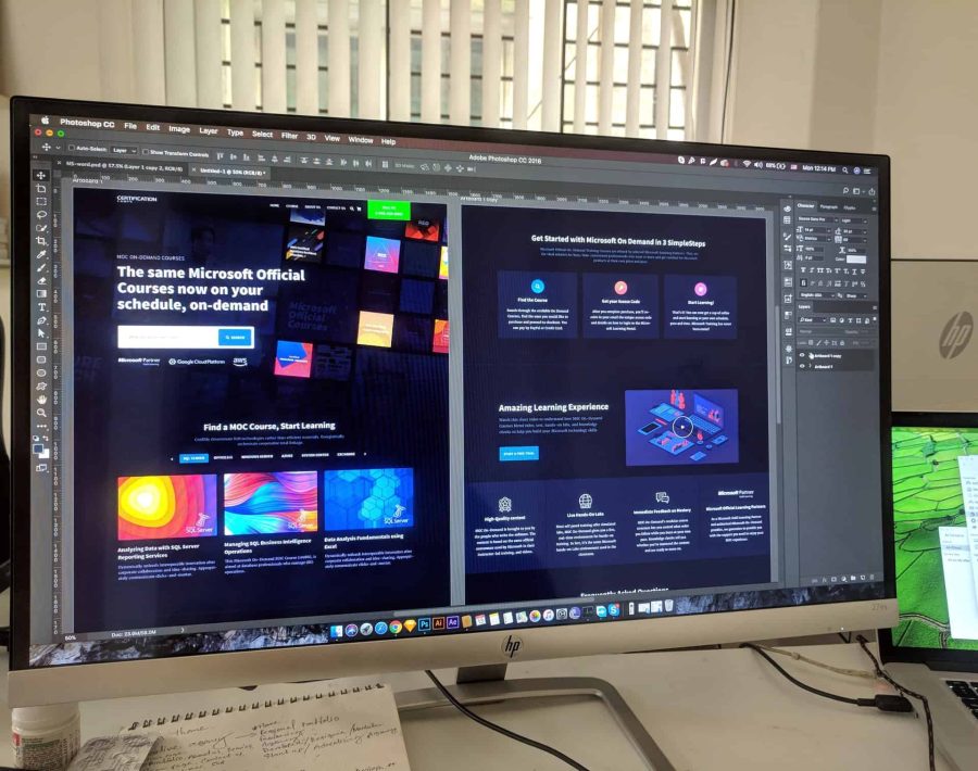
 Know Your Target Audience: It is important that your web site appeals to your target audience. Think of the kind of people who are most likely to buy your products and try to incorporate colors and images that will draw them in and keep them engaged.
 Once your redesign is completed, you can use social media and other channels to find out what visitors think of your new look. This will help you find out what’s working and what isn’t, and it will prepare you for future updates.
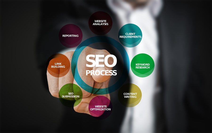
 Being at the top of the search results increases traffic to your site, which increases the number of prospective customers, which increases the number of actual customers. Traffic from SEO is like having eager customers lining up to purchase from you.
 Another reason you should make use of SEO is it increases your site’s usability.
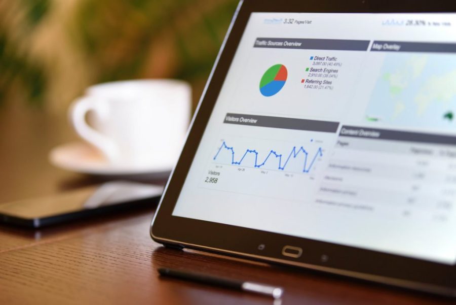
 Millions of visitors are visiting so many sites each day. There must be a tool which can give you exact numbers of visitors, which can measure the success of your web site over the net. Web analytics provides you the answer to every question. It is the tool which helps in evaluating the success of your website.
 There is a little bit of difference in both technologies. Server log file helps one to get to know the exact figure of requests being made by the customer or visitor to the web server. But now it has become the difficult method as some more features have been added in this technique. Each and every professional SEO Company might be working on this technique. In the page tagging, the cookies were assigned to each and every user to find out the number of unique visits to your site. We can take the example of Google analytic for page tagging. So with the help of this awesome web analytics, we can easily analyze the site.

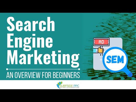
 What is Paid SEM?
 There are too many benefits of doing paid promotion for any web site. It definitely gives you the surety of your link. You can put your link in the good places and anywhere in the site where you want to put. But in the free promotion, you can not do this. Paid promotion always for a life long but free is not for a life long it is just for some specific time period. You do not need to wait for the approval in the paid promotion, whenever you will pay for your submission your link will be live and search engine will start crawling your site. It is quite difficult to find free places over the net if you will get the places they will not be as good as you want. But you can find paid places easily.
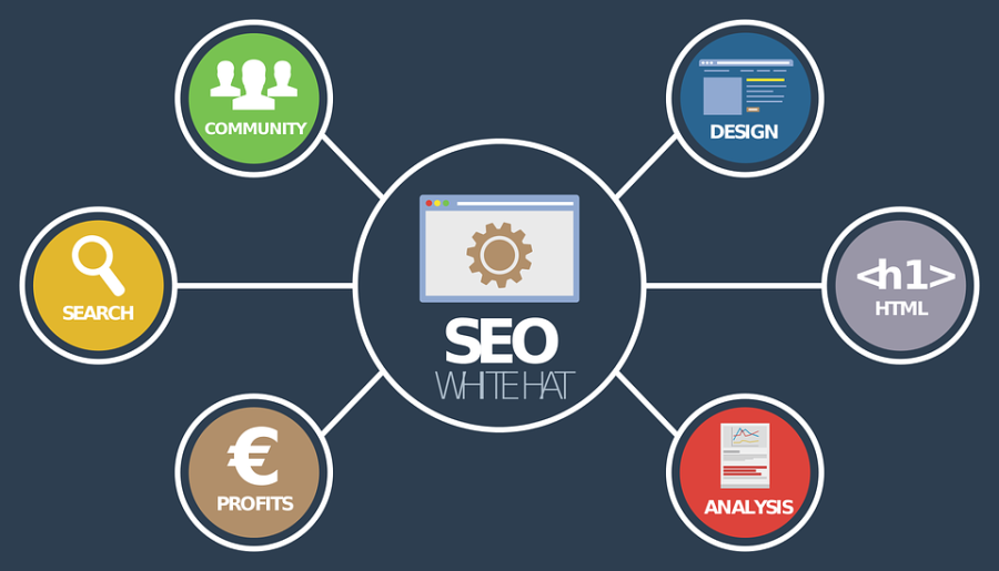
 What is SEO?
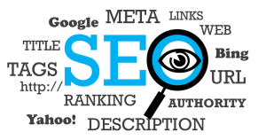 Search Engine Optimization

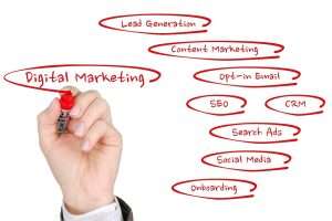 What is Online Marketing?
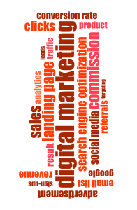 So many types are available for online marketing. Here are some specific areas where you must start your online marketing –

 We have always tried to give our best in the field of Link Building. Our link building services help in taming search engines ranking and carry subject based traffic to your site. Our skilled experts help you in making your site more popular and in getting maximum business. The intention of services is to make you comfortable in your business sphere. We are very happy to offer these services for the last two years. During this period we have always made an effort to adopt new means and techniques. We also provide link exchange and link popularity services that can help you to enhance and get better link popularity for your website.